Introduction
Design Systems Management Tools help teams create, organize, document, share, and maintain reusable design assets such as UI components, design tokens, brand guidelines, accessibility rules, code snippets, and product patterns. In simple English, these tools keep design and development teams aligned so products look consistent and work smoothly across websites, mobile apps, and enterprise platforms.
In a modern product environment, design systems matter because companies need faster delivery, stronger brand consistency, better accessibility, and closer collaboration between designers, developers, product managers, and content teams. These tools are useful for building reusable UI libraries, managing design tokens, documenting component usage, supporting developer handoff, and scaling design standards across multiple teams.
Buyers should evaluate ease of use, design tool integration, developer workflow support, token management, documentation features, governance controls, collaboration, security, versioning, scalability, and pricing flexibility.
Best for: product teams, UX teams, frontend teams, design operations teams, SaaS companies, agencies, and enterprises managing multiple digital products.
Not ideal for: very small teams with only a few static screens, teams without reusable components, or businesses that only need basic file storage instead of a structured design system.
Key Trends in Design Systems Management Tools
- Design tokens are becoming central because teams want consistent colors, spacing, typography, themes, and brand rules across design and code.
- AI-assisted documentation is growing, especially for summarizing component usage, suggesting descriptions, and improving design system maintenance.
- Design-to-code workflows are becoming stronger as teams expect smoother handoff from Figma or design files to frontend components.
- Component governance is now more important because large teams need approval flows, ownership, version control, and change tracking.
- Accessibility is moving earlier in the workflow, helping teams check contrast, usage rules, and inclusive design patterns before development.
- Multi-brand and multi-product support is increasing because enterprise teams often manage several brands, regions, or product families.
- Developer-first design systems are rising, especially where teams want documentation tied directly to React, Vue, Angular, or web component libraries.
- Integration depth is a key buying factor, with stronger demand for GitHub, GitLab, Jira, Slack, Figma, Storybook, CI/CD, and API support.
- Security expectations are higher, especially for SSO, MFA, RBAC, audit logs, encryption, and enterprise admin controls.
- Pricing is becoming more role-based, with different costs for editors, viewers, contributors, developers, and enterprise administrators.
How We Selected These Tools
- Tools were chosen based on category relevance and broad recognition in design system, design operations, and product development workflows.
- Priority was given to platforms that support documentation, component libraries, design tokens, developer handoff, or governance.
- The list balances design-first, developer-first, enterprise, SMB, and specialized design token tools.
- Tools with strong ecosystem connections to Figma, code repositories, frontend frameworks, or documentation workflows were prioritized.
- Enterprise readiness was considered, including security options, governance, team controls, and scalability.
- Ease of adoption was considered for teams moving from basic design files to structured design systems.
- Developer workflow support was evaluated because design systems must connect design decisions with real implementation.
- Tools were compared on practical fit, not only feature count.
- Public ratings were not guessed. Where a rating is uncertain, “N/A” is used.
- The scoring table is comparative and should be validated through pilots before final purchase decisions.
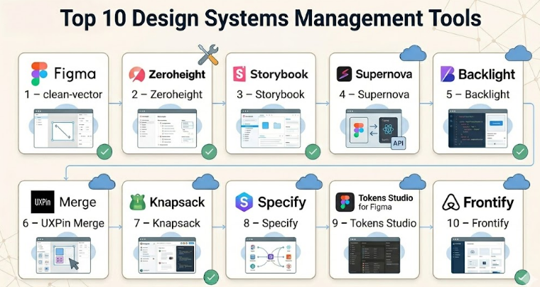
Top 10 Design Systems Management Tools
#1 — Figma
Short description :
Figma is one of the most widely used collaborative design platforms for UI design, prototyping, component libraries, and design system workflows. It is popular among product designers, UX teams, developers, and design operations teams. Figma supports shared libraries, variables, reusable components, team files, comments, and handoff features. For many teams, it becomes the starting point for design system creation before documentation and code integration are added through other tools. It is best for teams that want a strong design-first workspace with real-time collaboration.
Key Features
- Shared component libraries for reusable design assets.
- Variables and styles for managing colors, typography, spacing, and themes.
- Real-time collaboration for designers, developers, and stakeholders.
- Prototyping and design review workflows.
- Dev Mode for developer inspection and handoff.
- Plugin ecosystem for tokens, accessibility, documentation, and automation.
- Team and organization-level asset management.
Pros
- Very strong adoption across design and product teams.
- Easy collaboration between designers, developers, and reviewers.
- Large ecosystem of plugins and community resources.
Cons
- Full design system governance may require additional tools.
- Large files and complex libraries can require careful maintenance.
- Advanced enterprise administration may increase cost.
Platforms / Deployment
Web / Windows / macOS
Cloud
Security & Compliance
SSO/SAML, MFA, RBAC, encryption, and enterprise administration features are commonly available in enterprise plans. Specific compliance coverage may vary by plan. SOC 2 and GDPR-related controls are commonly associated with enterprise-grade SaaS platforms, but buyers should verify current documentation.
Integrations & Ecosystem
Figma has a strong ecosystem for design, prototyping, documentation, developer handoff, and design operations. It is often connected with design token tools, project management platforms, and developer workflows.
- Jira
- Slack
- GitHub through plugins or workflow integrations
- Storybook-related workflows
- Design token plugins
- Accessibility plugins
Support & Community
Figma has strong documentation, a large user community, many templates, educational resources, and enterprise support options. Community strength is one of its biggest advantages.
#2 — Zeroheight
Short description :
Zeroheight is a design system documentation platform focused on helping teams create living style guides, component documentation, brand guidelines, and usage rules. It is useful for design operations teams that need a central place to explain how components should be used. Zeroheight is often used alongside Figma and code documentation tools. It is best for teams that need polished documentation for designers, developers, product managers, and business stakeholders. It works well when teams want design system knowledge to be easy to find and maintain.
Key Features
- Centralized design system documentation.
- Integration with design tools for syncing assets.
- Component usage guidelines and content sections.
- Brand guideline support.
- Versioning and publishing workflows.
- Team collaboration and permissions.
- Support for embedding code, examples, and design assets.
Pros
- Strong for design system documentation and knowledge sharing.
- Friendly for non-technical stakeholders.
- Good fit for design operations and brand governance.
Cons
- Less developer-native than code-first tools.
- Advanced workflows may require integration planning.
- Some teams may still need separate token or component build tools.
Platforms / Deployment
Web
Cloud
Security & Compliance
SSO/SAML and role-based controls may be available depending on plan. Other compliance details should be verified. If not confirmed during procurement, use “Not publicly stated.”
Integrations & Ecosystem
Zeroheight is built to connect documentation with design and development workflows. It works best when used as the visible documentation layer of a broader design system stack.
- Figma
- Sketch
- Storybook
- Code embeds
- Slack workflow references
- Design asset sync workflows
Support & Community
Zeroheight provides documentation and customer support options. It has a strong design system audience, especially among design operations and UX teams. Support levels may vary by plan.
#3 — Storybook
Short description :
Storybook is a developer-focused tool for building, testing, and documenting UI components in isolation. It is especially strong for frontend teams that want design systems connected directly to working code. Storybook supports component examples, visual testing workflows, documentation pages, and integration with frontend frameworks. It is widely used with React, Vue, Angular, and other UI technologies. It is best for teams that treat the coded component library as the source of truth.
Key Features
- Component development in isolation.
- Documentation for coded UI components.
- Support for many frontend frameworks.
- Add-ons for accessibility, testing, controls, and documentation.
- Visual review and component state examples.
- Strong developer workflow alignment.
- Open-source ecosystem and community adoption.
Pros
- Excellent for developer-first design systems.
- Strong support for frontend component testing and documentation.
- Large ecosystem and community.
Cons
- Less friendly for non-technical users without setup support.
- Requires developer ownership and maintenance.
- Design documentation may need another tool for broader business users.
Platforms / Deployment
Web / Local development environments
Self-hosted / Cloud through related hosting or deployment workflows / Hybrid
Security & Compliance
Security depends on how Storybook is hosted and managed. For self-hosted or internal deployment, compliance depends on the organization’s infrastructure. Built-in enterprise compliance details are not publicly stated for the open-source core.
Integrations & Ecosystem
Storybook has one of the strongest developer ecosystems in this category. It works well with frontend frameworks, testing tools, CI/CD, and design review workflows.
- React
- Vue
- Angular
- Web Components
- GitHub
- Testing and visual regression tools
Support & Community
Storybook has strong open-source documentation, community examples, add-ons, and developer adoption. Commercial support depends on related services and internal team setup.
#4 — Supernova
Short description :
Supernova is a design system platform focused on design tokens, documentation, automation, and design-to-code workflows. It helps teams connect design decisions with production-ready outputs for developers. Supernova is useful for organizations that want to manage tokens, publish documentation, and create automated exports for different platforms. It is often used by teams that want a more structured bridge between design tools and engineering systems. It is best for design operations and engineering teams working together on scalable systems.
Key Features
- Design token management.
- Automated code export workflows.
- Design system documentation.
- Figma integration.
- Multi-platform token output.
- Versioning and governance workflows.
- Support for design-to-development handoff.
Pros
- Strong focus on design tokens and automation.
- Useful for scaling design systems across platforms.
- Good fit for teams that need designer-developer alignment.
Cons
- May require setup effort for token architecture.
- Best value appears when teams already have mature design system goals.
- Smaller teams may find it more advanced than needed.
Platforms / Deployment
Web
Cloud
Security & Compliance
Enterprise security features may vary by plan. SSO and access controls may be available, but buyers should confirm directly. Compliance details are Not publicly stated unless verified during procurement.
Integrations & Ecosystem
Supernova focuses heavily on connecting design tools with development output. It is useful when teams need repeatable design token exports and structured documentation.
- Figma
- Git-based workflows
- Code export pipelines
- Design token formats
- Documentation publishing
- Platform-specific development workflows
Support & Community
Supernova provides product documentation and support resources. Community size is more specialized than Figma or Storybook, but it is relevant for teams focused on tokens and automation.
#5 — Backlight
Short description :
Backlight is a developer-oriented design system platform for building, documenting, and maintaining frontend components. It supports code-based design systems and helps teams manage components, documentation, and collaboration in one environment. Backlight is useful for teams that want their design system closely connected to actual code. It is especially relevant for frontend teams, platform teams, and design system engineers. It works best where engineering ownership is strong.
Key Features
- Code-first design system development.
- Component documentation.
- Support for frontend technologies.
- Collaboration for design system teams.
- Package and component workflow support.
- Preview and documentation environment.
- Integration with development workflows.
Pros
- Strong fit for engineering-led design systems.
- Helps keep documentation close to code.
- Useful for reusable component development.
Cons
- May be less approachable for non-technical teams.
- Requires frontend development maturity.
- May not replace a visual design workspace.
Platforms / Deployment
Web
Cloud / Hybrid depending on workflow
Security & Compliance
Security and compliance details should be verified by plan. If not confirmed, use “Not publicly stated.” Access control and team permissions may vary.
Integrations & Ecosystem
Backlight is designed for developer workflows and component-based frontend systems. It works best when connected to package management, code repositories, and component documentation.
- Git workflows
- Frontend frameworks
- Component libraries
- Package workflows
- Documentation environments
- Design token workflows
Support & Community
Backlight provides documentation and support options. Community strength is more niche compared with large open-source tools, but it is relevant for code-first design system teams.
#6 — UXPin Merge
Short description :
UXPin Merge helps teams design with real coded components instead of only static design elements. It is useful for organizations that want design prototypes to stay closer to production UI behavior. UXPin Merge is especially valuable when design and engineering teams want to reduce mismatch between mockups and implemented components. It supports design system workflows where code components are reused in the design process. It is best for mature teams with established component libraries.
Key Features
- Design with coded components.
- Support for interactive prototypes.
- Design system component reuse.
- Developer-designer collaboration.
- Component library connection.
- Handoff support.
- Enterprise workflow options.
Pros
- Reduces the gap between design and production code.
- Helpful for complex product interfaces.
- Strong for teams with mature coded component libraries.
Cons
- Requires engineering setup and component readiness.
- May be more complex than basic design tools.
- Smaller teams may not need code-connected design workflows.
Platforms / Deployment
Web
Cloud
Security & Compliance
Enterprise security options may include access controls and SSO depending on plan. Specific compliance details should be verified. If uncertain, use “Not publicly stated.”
Integrations & Ecosystem
UXPin Merge is strongest when connected with frontend component libraries and design system code. It supports workflows where design teams use production-like components.
- React component workflows
- Git-based workflows
- Design system libraries
- Developer handoff workflows
- Prototyping workflows
- Product design collaboration
Support & Community
UXPin provides documentation, learning resources, and support options. Merge workflows may require onboarding support because they involve closer engineering collaboration.
#7 — Knapsack
Short description :
Knapsack is a design system platform built for documentation, governance, and cross-functional collaboration. It helps teams create a central source of truth for components, patterns, tokens, and design system guidance. Knapsack is often used by enterprise and mid-market teams that need structure, process, and scalability. It supports design system operations where multiple teams contribute to shared standards. It is best for organizations that need governance beyond a basic component library.
Key Features
- Central design system documentation.
- Component and pattern management.
- Governance and contribution workflows.
- Design token support.
- Collaboration across design, engineering, and product.
- Structured documentation and publishing.
- Support for scaling design systems across teams.
Pros
- Strong for design system governance.
- Good fit for enterprise design operations.
- Helps create a shared source of truth.
Cons
- May require process maturity to get full value.
- Could be more than small teams need.
- Setup may require stakeholder alignment.
Platforms / Deployment
Web
Cloud
Security & Compliance
Enterprise-grade access controls may be available depending on plan. Specific compliance certifications are Not publicly stated unless confirmed during evaluation.
Integrations & Ecosystem
Knapsack supports design system workflows across design and development teams. It is useful when teams need a structured documentation and governance layer.
- Figma workflows
- Code component documentation
- Design token workflows
- Product team collaboration
- Developer handoff
- Internal contribution workflows
Support & Community
Knapsack is focused on design system teams and offers support resources. Community size is more specialized, but its audience is highly relevant for enterprise design operations.
#8 — Specify
Short description :
Specify is a design token and design data platform that helps teams collect, transform, and distribute design decisions across tools and codebases. It is useful for teams that need to move tokens from design tools into engineering workflows in a consistent way. Specify focuses on automation, token pipelines, and design data synchronization. It is best for teams managing multi-platform design systems where tokens must stay consistent across web, mobile, and brand surfaces.
Key Features
- Design token collection and distribution.
- Token transformation workflows.
- Figma integration.
- API-based automation.
- Multi-platform token delivery.
- Version and pipeline workflows.
- Support for design-to-code consistency.
Pros
- Strong focus on design token automation.
- Useful for multi-platform product teams.
- Helps reduce manual token updates.
Cons
- Specialized tool; may need another platform for full documentation.
- Requires clear token architecture.
- Not ideal for teams without mature design tokens.
Platforms / Deployment
Web
Cloud
Security & Compliance
Security details should be reviewed by plan. If compliance certifications are not confirmed, use “Not publicly stated.”
Integrations & Ecosystem
Specify works best as part of a design token pipeline. It connects design decisions with development outputs and automation workflows.
- Figma
- APIs
- Code repositories
- Token transformation tools
- Web and mobile development workflows
- CI/CD-style design data pipelines
Support & Community
Specify provides documentation and support resources. Its community is more focused on design tokens and design engineering rather than general design documentation.
#9 — Tokens Studio
Short description :
Tokens Studio is a design token tool widely used with Figma workflows. It helps teams create, manage, and apply tokens for colors, typography, spacing, themes, and other reusable design decisions. It is especially helpful for teams adopting token-driven design systems. Tokens Studio is not a full design system documentation platform by itself, but it plays an important role in connecting design decisions with implementation. It is best for teams that want better control over tokens inside design workflows.
Key Features
- Design token creation and management.
- Figma-based token workflows.
- Support for themes and modes.
- Token export and synchronization options.
- Useful for colors, typography, spacing, and sizing.
- Collaboration around reusable design decisions.
- Support for token-driven design system structure.
Pros
- Very useful for token-first design systems.
- Fits naturally into Figma workflows.
- Helps improve consistency across design files.
Cons
- Not a complete documentation or governance platform.
- Requires token naming discipline.
- Engineering integration may need additional setup.
Platforms / Deployment
Figma plugin / Web-related workflows
Cloud / Varies depending on setup
Security & Compliance
Security depends on the connected workflow and plan. Specific compliance details are Not publicly stated unless confirmed.
Integrations & Ecosystem
Tokens Studio is strongest inside the design token ecosystem. It is often used with Figma, code export workflows, and design token pipelines.
- Figma
- Token export workflows
- Git-based workflows
- Design token formats
- Theming workflows
- Developer handoff pipelines
Support & Community
Tokens Studio has strong relevance in the design token community. Documentation and community resources are available, but enterprise support details may vary.
#10 — Frontify
Short description :
Frontify is a brand management and digital asset platform that also supports design system and brand guideline workflows. It is useful for teams that need brand consistency across marketing, product, design, and communications. While it is not only a developer-focused design system tool, it helps organizations manage brand assets, guidelines, templates, and reusable standards. It is best for companies where design systems and brand systems need to work together across many teams.
Key Features
- Brand guideline management.
- Digital asset management.
- Design system and style guide support.
- Template and asset governance.
- Collaboration for brand and design teams.
- Centralized brand portal.
- Enterprise user management options.
Pros
- Strong for brand consistency across large organizations.
- Useful beyond product design teams.
- Good fit for marketing, brand, and design operations.
Cons
- Less developer-first than Storybook or Backlight.
- May not be enough for coded component library management.
- More valuable when brand governance is a major need.
Platforms / Deployment
Web
Cloud
Security & Compliance
Enterprise security controls may be available depending on plan. Specific certifications should be verified. If uncertain, use “Not publicly stated.”
Integrations & Ecosystem
Frontify fits well into brand, design, and marketing workflows. It is useful when design system guidance must connect with brand assets and business-wide usage.
- Design tools
- Digital asset workflows
- Brand portals
- Marketing workflows
- Template systems
- Collaboration tools
Support & Community
Frontify provides documentation, onboarding, and support options. Its community is strongest among brand, marketing, and design operations teams.
Comparison Table (Top 10)
| Tool Name | Best For | Platform(s) Supported | Deployment (Cloud/Self-hosted/Hybrid) | Standout Feature | Public Rating |
|---|---|---|---|---|---|
| Figma | Design-first product teams | Web, Windows, macOS | Cloud | Collaborative component libraries and design workflows | N/A |
| Zeroheight | Design system documentation | Web | Cloud | Living style guides and documentation | N/A |
| Storybook | Developer-first component systems | Web, local development | Self-hosted / Hybrid | Code-based UI component documentation | N/A |
| Supernova | Token-driven design operations | Web | Cloud | Design token automation and code export | N/A |
| Backlight | Engineering-led design systems | Web | Cloud / Hybrid | Code-first component documentation | N/A |
| UXPin Merge | Teams designing with coded components | Web | Cloud | Real code components in design workflow | N/A |
| Knapsack | Enterprise design system governance | Web | Cloud | Structured governance and documentation | N/A |
| Specify | Design token pipelines | Web | Cloud | Token collection, transformation, and delivery | N/A |
| Tokens Studio | Figma-based design token management | Figma plugin, web-related workflows | Varies / N/A | Token management inside design workflows | N/A |
| Frontify | Brand and design system alignment | Web | Cloud | Brand guidelines and asset governance | N/A |
Evaluation & Design Systems Management Tools
| Tool Name | Core (25%) | Ease (15%) | Integrations (15%) | Security (10%) | Performance (10%) | Support (10%) | Value (15%) | Weighted Total (0–10) |
|---|---|---|---|---|---|---|---|---|
| Figma | 9 | 9 | 9 | 8 | 8 | 9 | 8 | 8.65 |
| Zeroheight | 8 | 9 | 8 | 7 | 8 | 8 | 8 | 8.05 |
| Storybook | 9 | 7 | 9 | 7 | 8 | 9 | 9 | 8.35 |
| Supernova | 8 | 8 | 8 | 7 | 8 | 7 | 8 | 7.75 |
| Backlight | 8 | 7 | 8 | 7 | 8 | 7 | 8 | 7.65 |
| UXPin Merge | 8 | 7 | 7 | 7 | 8 | 7 | 7 | 7.45 |
| Knapsack | 8 | 8 | 7 | 7 | 8 | 7 | 7 | 7.55 |
| Specify | 8 | 7 | 8 | 7 | 8 | 7 | 8 | 7.65 |
| Tokens Studio | 7 | 8 | 8 | 6 | 8 | 7 | 9 | 7.60 |
| Frontify | 8 | 8 | 7 | 7 | 8 | 8 | 7 | 7.65 |
These scores are comparative, not absolute. A higher score does not automatically mean the tool is the best choice for every team. For example, Storybook may score strongly for developer-first teams, while Zeroheight may be better for documentation-heavy design operations. Buyers should use the score as a shortlist guide, then validate real fit through a pilot, integration review, security review, and team feedback.
Which Design Systems Management Tools
Solo / Freelancer
Solo designers and freelancers usually need speed, simplicity, and low setup effort. Figma is often the most practical starting point because it supports design files, reusable components, comments, and handoff in one place. Tokens Studio can be useful if the freelancer is building token-based design systems for clients. A full governance platform may be unnecessary unless the freelancer manages multiple client systems.
SMB
Small and medium businesses should focus on tools that improve consistency without creating heavy process. Figma plus Zeroheight is a strong combination for design and documentation. Storybook can be added when the frontend team is ready to maintain coded components. SMBs should avoid buying too many tools before they have clear ownership and naming standards.
Mid-Market
Mid-market teams often need better structure because multiple product teams may share the same design language. Figma, Zeroheight, Storybook, Supernova, or Knapsack can work well depending on maturity. If the organization has active frontend teams, Storybook or Backlight becomes important. If tokens are becoming a major challenge, Supernova, Specify, or Tokens Studio should be evaluated.
Enterprise
Enterprise teams should prioritize governance, security, scalability, admin controls, documentation, and multi-team adoption. Figma Enterprise, Zeroheight, Knapsack, Supernova, Storybook, and Frontify can all play different roles. Enterprises should not choose based only on interface design. They should evaluate SSO, RBAC, audit logs, design token workflows, contribution models, compliance needs, and long-term maintainability.
Budget vs Premium
Budget-conscious teams can start with Figma, Storybook, and Tokens Studio-style workflows before adding premium documentation or governance layers. Premium platforms are better when teams need scale, support, permissions, brand governance, or design token automation. The right choice depends on whether the team’s biggest problem is documentation, token consistency, developer handoff, or enterprise control.
Feature Depth vs Ease of Use
Figma and Zeroheight are easier for broad teams to adopt. Storybook, Backlight, Specify, and Supernova offer deeper technical workflows but may need design engineering support. UXPin Merge is powerful when teams want coded components inside design workflows, but it requires engineering readiness. Teams should choose depth only when they have the skills and process to maintain it.
Integrations & Scalability-
For integration-heavy environments, prioritize tools that connect with Figma, GitHub, GitLab, Jira, Slack, CI/CD pipelines, frontend frameworks, and token formats. Storybook, Supernova, Specify, Backlight, and Tokens Studio are strong for technical scalability. Zeroheight, Knapsack, and Frontify are stronger for organizational scalability, documentation, and governance.
Security & Compliance Needs
Security-focused teams should verify SSO/SAML, MFA, RBAC, audit logs, encryption, admin controls, data residency, and compliance documentation before purchase. Enterprises should not rely only on marketing pages. They should involve IT, security, procurement, design operations, and engineering before finalizing a platform. If compliance details are not clearly available, treat them as “Not publicly stated” until confirmed.
Frequently Asked Questions (FAQs)
1. What is a Design Systems Management Tool?
A Design Systems Management Tool helps teams manage reusable design assets, UI components, documentation, design tokens, and usage guidelines. It keeps designers, developers, and product teams aligned so products stay consistent and easier to maintain.
2. How is it different from a normal design tool?
A normal design tool helps create screens, prototypes, and visual layouts. A design system management tool helps organize reusable patterns, document rules, connect design with code, and maintain consistency across teams and products.
3. What pricing model do these tools usually follow?
Most tools use subscription pricing based on users, editors, seats, teams, or enterprise plans. Some developer-first tools may have open-source options, while enterprise platforms often require custom pricing. Pricing should be verified directly before purchase.
4. How long does implementation usually take?
Implementation depends on team size, existing component maturity, token structure, and documentation quality. A small team can start quickly, but a mature enterprise rollout may require planning, governance, migration, training, and stakeholder alignment.
5. What are the most common mistakes teams make?
Common mistakes include unclear ownership, poor naming standards, outdated documentation, weak developer involvement, and treating the design system as a one-time project. A design system needs ongoing maintenance, contribution rules, and regular review.
6. Are these tools secure enough for enterprise use?
Many tools offer enterprise security features, but buyers should verify SSO, MFA, RBAC, encryption, audit logs, and compliance documentation. If a vendor does not clearly provide security details, treat them as Not publicly stated until confirmed.
7. Do Design Systems Management Tools support scalability?
Yes, many tools support scalability through shared libraries, documentation, tokens, versioning, permissions, and integrations. However, scalability also depends on team process, governance, contribution models, and how well the system connects with engineering workflows.
8. Which integrations are most important?
The most important integrations usually include Figma, Storybook, GitHub, GitLab, Jira, Slack, frontend frameworks, design token tools, and documentation platforms. The right integrations depend on whether the team is design-led, developer-led, or enterprise-governed.
9. Is switching from one design system tool difficult?
Switching can be difficult if components, tokens, documentation, and workflows are deeply embedded. Teams should audit existing assets, map dependencies, test migration paths, and run a pilot before fully switching platforms.
10. What are good alternatives to dedicated design system tools?
Alternatives include using Figma libraries, internal documentation platforms, Git-based documentation, Storybook, wiki tools, or custom developer portals. These can work for smaller teams, but larger teams often need stronger governance and automation.
Conclusion
Design Systems Management Tools are now essential for teams that want consistent, scalable, and maintainable digital products. The best tool depends on the team’s real problem. If the main challenge is design collaboration, Figma is a strong starting point. If documentation is weak, Zeroheight or Knapsack may help. If the coded component library is the source of truth, Storybook or Backlight is more suitable. If design tokens and automation are becoming difficult to manage, Supernova, Specify, or Tokens Studio may provide better structure. For brand-heavy organizations, Frontify can connect product design with wider brand governance.