Introduction
Data Visualization tools are software platforms that transform raw data into visual formats like charts, graphs, dashboards, and interactive reports. Instead of reading spreadsheets or raw numbers, users can quickly understand trends, patterns, and insights through visual storytelling.
In the current landscape, data is growing rapidly across systems, applications, and devices. As a result, organizations need tools that not only display data but also enable real-time decision-making, AI-driven insights, and collaborative analytics. Modern data visualization tools now include automation, natural language queries, and predictive visualizations, making them more accessible to non-technical users.
Common use cases:
- Executive dashboards and KPI tracking
- Marketing campaign performance visualization
- Financial reporting and forecasting
- Product analytics and user behavior insights
- Operational monitoring and alerting
What buyers should evaluate:
- Ease of use and learning curve
- Visualization flexibility and customization
- Data integration capabilities
- Real-time and streaming support
- Scalability with large datasets
- Security and compliance features
- Collaboration and sharing features
- AI/automation capabilities
- Deployment options (cloud vs self-hosted)
Best for: Data analysts, business users, product managers, marketers, startups, and large enterprises across industries like finance, SaaS, retail, and healthcare.
Not ideal for: Individuals or teams with very basic reporting needs or those who only require simple spreadsheet charts. In such cases, lightweight tools may be sufficient.
Key Trends in Data Visualization Tools
- AI-assisted visualization: Auto-generated charts and insights based on data patterns
- Natural language queries: Ask questions in plain English and get visual answers
- Real-time dashboards: Live data updates for operational decision-making
- Embedded analytics: Visualizations embedded into applications and workflows
- Self-service analytics: Non-technical users building dashboards independently
- Cloud-native platforms: Majority of tools shifting to SaaS-first deployment
- Data storytelling: Tools focusing on narrative-driven visual insights
- Cross-platform accessibility: Mobile-first dashboards and responsive design
- Governance integration: Built-in data security and compliance controls
- API-driven extensibility: Custom integrations and developer-friendly platforms
How We Selected These Tools (Methodology)
- Considered market popularity and adoption across industries
- Evaluated core visualization capabilities and innovation
- Assessed performance with large and complex datasets
- Reviewed security features and enterprise readiness
- Analyzed integration ecosystems and API support
- Looked at ease of use for both technical and non-technical users
- Balanced enterprise tools vs SMB and open-source options
- Evaluated vendor support, documentation, and community strength
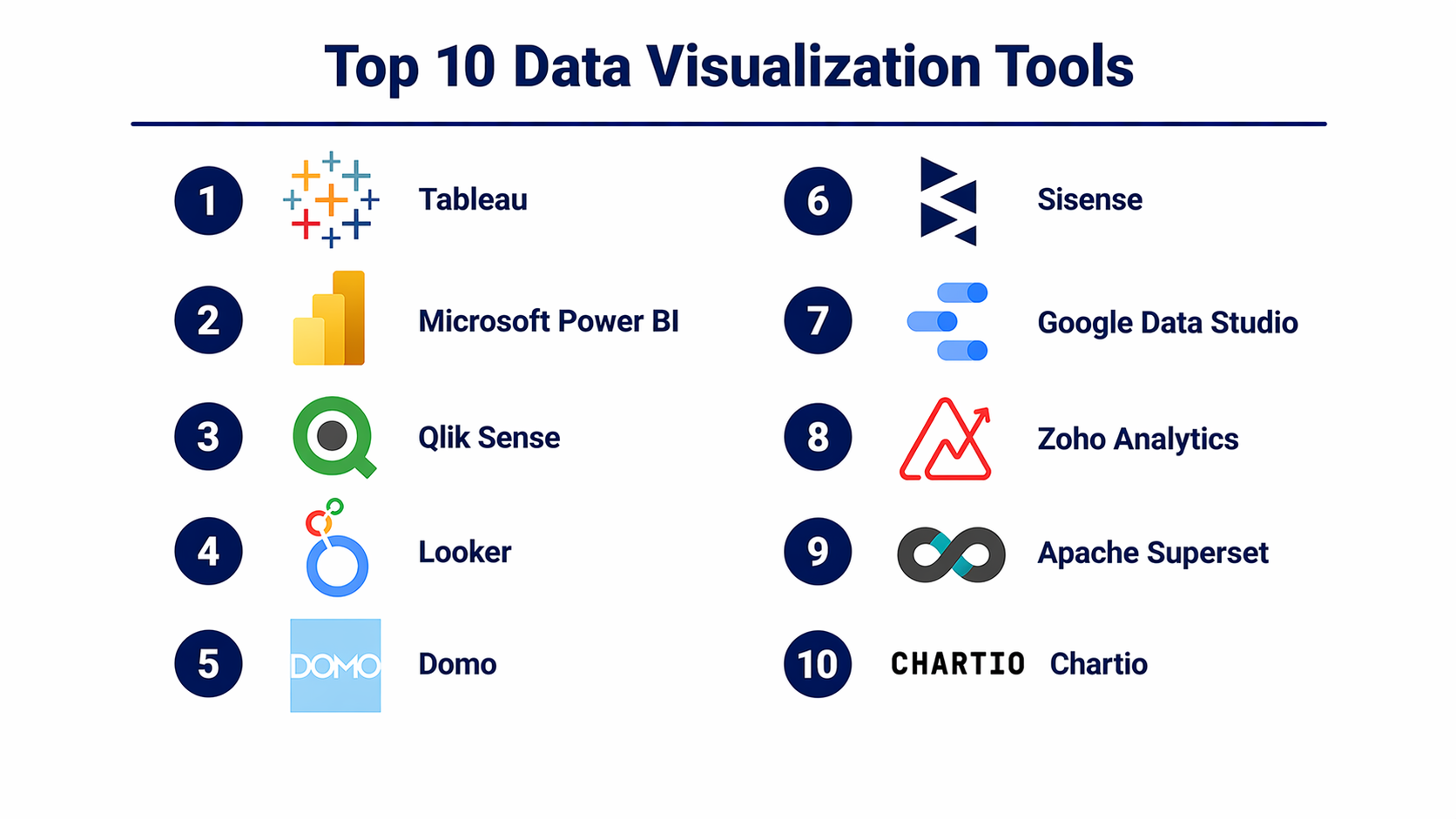
Top 10 Data Visualization Tools
#1 — Tableau
Short description (2–3 lines): A leading data visualization platform known for advanced dashboards and deep analytics. Widely used by enterprises and analysts for interactive reporting.
Key Features
- Drag-and-drop dashboard creation
- Advanced charting and visualizations
- Real-time data analysis
- Data blending and preparation
- AI-powered insights
Pros
- Best-in-class visual capabilities
- Strong community and ecosystem
Cons
- Expensive licensing
- Steeper learning curve
Platforms / Deployment
Web / Windows / macOS
Cloud / Self-hosted
Security & Compliance
SSO, MFA, encryption, RBAC; Not publicly stated for certifications
Integrations & Ecosystem
Supports a wide range of data sources and enterprise systems.
- Databases
- Cloud platforms
- APIs
- Data warehouses
Support & Community
Large global community, extensive documentation, strong enterprise support.
#2 — Microsoft Power BI
Short description (2–3 lines): A powerful and cost-effective visualization tool integrated with Microsoft ecosystem. Ideal for businesses using Excel, Azure, and Office tools.
Key Features
- Interactive dashboards
- AI-driven insights
- Data modeling
- Real-time analytics
- Seamless Excel integration
Pros
- Affordable pricing
- Strong integration ecosystem
Cons
- Performance issues with large datasets
- Limited customization in visuals
Platforms / Deployment
Web / Windows / iOS / Android
Cloud / Hybrid
Security & Compliance
SSO, MFA, encryption, RBAC; SOC 2, ISO 27001 commonly referenced
Integrations & Ecosystem
Deep integration with Microsoft and external platforms.
- Azure
- Excel
- SQL Server
- APIs
Support & Community
Very strong community, enterprise support, and learning resources.
#3 — Qlik Sense
Short description (2–3 lines): A self-service visualization platform using an associative data model for flexible data exploration.
Key Features
- Associative analytics engine
- Interactive dashboards
- AI insights
- Data storytelling
- Embedded analytics
Pros
- Powerful data exploration
- Flexible visual analysis
Cons
- Complex interface
- Setup requires expertise
Platforms / Deployment
Web
Cloud / Hybrid
Security & Compliance
Not publicly stated
Integrations & Ecosystem
- APIs
- Databases
- Cloud systems
Support & Community
Strong enterprise support and good documentation.
#4 — Looker
Short description (2–3 lines): A modern data platform focused on modeling and visual analytics, designed for developers and data teams.
Key Features
- Semantic data modeling
- Embedded dashboards
- Real-time reporting
- API-first architecture
- SQL-based querying
Pros
- Strong governance capabilities
- Highly customizable
Cons
- Requires SQL knowledge
- Expensive
Platforms / Deployment
Web
Cloud
Security & Compliance
Not publicly stated
Integrations & Ecosystem
- Cloud platforms
- APIs
- Data warehouses
Support & Community
Enterprise-grade support, growing developer community.
#5 — Domo
Short description (2–3 lines): A cloud-first visualization platform offering real-time dashboards and collaboration features.
Key Features
- Real-time dashboards
- Data connectors
- Collaboration tools
- Alerts and automation
- Mobile analytics
Pros
- Easy to use
- Strong cloud-native design
Cons
- Expensive
- Limited customization
Platforms / Deployment
Web / iOS / Android
Cloud
Security & Compliance
Not publicly stated
Integrations & Ecosystem
- Cloud applications
- APIs
- Data connectors
Support & Community
Moderate community, good vendor support.
#6 — Sisense
Short description (2–3 lines): A flexible platform designed for embedding visualizations into applications and scaling analytics.
Key Features
- Embedded analytics
- Custom dashboards
- Data integration
- AI insights
- API-driven architecture
Pros
- Highly customizable
- Strong embedding capabilities
Cons
- Requires technical expertise
- Pricing varies
Platforms / Deployment
Web
Cloud / Hybrid
Security & Compliance
Not publicly stated
Integrations & Ecosystem
- APIs
- Data warehouses
- Cloud services
Support & Community
Good support, smaller community compared to leaders.
#7 — Google Data Studio (Looker Studio)
Short description (2–3 lines): A free, cloud-based visualization tool for creating simple dashboards and reports.
Key Features
- Drag-and-drop dashboards
- Real-time data connections
- Collaboration features
- Custom reports
- Integration with Google services
Pros
- Free to use
- Easy setup
Cons
- Limited advanced features
- Performance limitations
Platforms / Deployment
Web
Cloud
Security & Compliance
Not publicly stated
Integrations & Ecosystem
- Google Analytics
- BigQuery
- APIs
Support & Community
Basic support, growing user community.
#8 — Zoho Analytics
Short description (2–3 lines): A cost-effective visualization tool designed for SMBs with easy reporting capabilities.
Key Features
- Drag-and-drop reporting
- AI assistant
- Data blending
- Embedded analytics
- Scheduled reports
Pros
- Affordable
- Easy to use
Cons
- Limited scalability
- Fewer advanced visual features
Platforms / Deployment
Web
Cloud
Security & Compliance
Not publicly stated
Integrations & Ecosystem
- Zoho ecosystem
- APIs
- Databases
Support & Community
Good documentation, SMB-focused support.
#9 — Apache Superset
Short description (2–3 lines): An open-source visualization tool for building dashboards with flexibility and customization.
Key Features
- Open-source dashboards
- SQL-based exploration
- Custom visualizations
- Scalable architecture
- Role-based access
Pros
- Free and flexible
- Strong customization
Cons
- Requires setup and maintenance
- Limited UI polish
Platforms / Deployment
Web
Self-hosted
Security & Compliance
Not publicly stated
Integrations & Ecosystem
- Databases
- APIs
Support & Community
Active open-source community.
#10 — Chartio
Short description (2–3 lines): A user-friendly visualization tool focused on simple dashboard creation for teams.
Key Features
- Visual query builder
- Cloud-based dashboards
- Data transformation
- Collaboration tools
- SQL support
Pros
- Easy to use
- Good for teams
Cons
- Limited scalability
- Feature limitations
Platforms / Deployment
Web
Cloud
Security & Compliance
Not publicly stated
Integrations & Ecosystem
- Databases
- APIs
- Cloud tools
Support & Community
Moderate support, smaller community.
Comparison Table (Top 10)
| Tool Name | Best For | Platform(s) Supported | Deployment | Standout Feature | Public Rating |
|---|---|---|---|---|---|
| Tableau | Advanced visualization | Web, Desktop | Cloud/Hybrid | Visual analytics | N/A |
| Power BI | SMB & Enterprise | Web, Windows, Mobile | Cloud/Hybrid | Microsoft integration | N/A |
| Qlik Sense | Data exploration | Web | Hybrid | Associative engine | N/A |
| Looker | Data modeling | Web | Cloud | Semantic layer | N/A |
| Domo | Real-time dashboards | Web, Mobile | Cloud | Live analytics | N/A |
| Sisense | Embedded analytics | Web | Hybrid | Custom dashboards | N/A |
| Looker Studio | Basic dashboards | Web | Cloud | Free visualization | N/A |
| Zoho Analytics | SMB reporting | Web | Cloud | Affordable BI | N/A |
| Apache Superset | Open-source | Web | Self-hosted | Custom dashboards | N/A |
| Chartio | Team dashboards | Web | Cloud | Ease of use | N/A |
Evaluation & Scoring of Data Visualization Tools
| Tool Name | Core | Ease | Integrations | Security | Performance | Support | Value | Weighted Total |
|---|---|---|---|---|---|---|---|---|
| Tableau | 9 | 7 | 8 | 8 | 9 | 9 | 7 | 8.3 |
| Power BI | 9 | 8 | 9 | 8 | 8 | 9 | 9 | 8.6 |
| Qlik Sense | 8 | 7 | 8 | 7 | 8 | 8 | 7 | 7.7 |
| Looker | 8 | 6 | 9 | 8 | 8 | 8 | 7 | 7.8 |
| Domo | 8 | 8 | 7 | 7 | 8 | 7 | 7 | 7.6 |
| Sisense | 8 | 7 | 8 | 7 | 8 | 7 | 7 | 7.6 |
| Looker Studio | 6 | 9 | 7 | 6 | 7 | 7 | 9 | 7.4 |
| Zoho Analytics | 7 | 9 | 7 | 6 | 7 | 7 | 9 | 7.6 |
| Apache Superset | 7 | 6 | 7 | 6 | 8 | 6 | 9 | 7.1 |
| Chartio | 6 | 8 | 6 | 6 | 7 | 6 | 8 | 6.9 |
How to interpret scores:
- These scores are comparative, not absolute
- Higher totals indicate better overall balance of features and value
- Weighting emphasizes core features and pricing value
- Choose based on your specific needs rather than only score
Which Data Visualization Tools Right for You?
Solo / Freelancer
Choose Looker Studio or Zoho Analytics for ease of use and affordability.
SMB
Power BI or Zoho Analytics offer strong features with reasonable cost.
Mid-Market
Tableau or Qlik Sense provide deeper analytics and scalability.
Enterprise
Power BI, Tableau, or Looker for governance, integrations, and performance.
Budget vs Premium
- Budget: Looker Studio, Zoho, Superset
- Premium: Tableau, Looker
Feature Depth vs Ease of Use
- Easy: Domo, Zoho
- Advanced: Tableau, Qlik
Integrations & Scalability
- Strong integrations: Power BI, Looker
- Scalable: Tableau, SAP-level platforms
Security & Compliance Needs
- Enterprise-grade: Power BI, Looker, Tableau
Frequently Asked Questions (FAQs)
What are data visualization tools?
They help convert raw data into charts, graphs, and dashboards for easier understanding.
Are they different from BI tools?
Visualization tools are often part of BI platforms but focus specifically on visual output.
Do I need coding skills?
Most tools are no-code, but advanced features may require SQL.
Are free tools available?
Yes, tools like Looker Studio and Superset offer free options.
Can they handle big data?
Yes, enterprise tools are designed for large datasets.
How secure are these tools?
Security varies by vendor; enterprise tools offer stronger controls.
How long does setup take?
Simple setups take hours; complex deployments take weeks.
Can I embed dashboards?
Yes, many tools support embedded analytics.
What industries use them?
All industries including finance, retail, healthcare, and tech.
Can I switch tools later?
Yes, but migration may require effort depending on data complexity.
Conclusion
Data visualization tools have become essential for modern organizations that rely on data-driven decision-making. Instead of manually analyzing spreadsheets, teams now use visual dashboards to quickly identify trends, risks, and opportunities. However, choosing the right tool depends heavily on your specific needs. If you are a small team or individual, affordability and simplicity should be your priority, making tools like Looker Studio or Zoho Analytics a good fit. Mid-sized organizations may benefit from platforms like Tableau or Qlik Sense, which offer deeper analytics capabilities. Enterprises, on the other hand, should focus on governance, scalability, and integration, where tools like Power BI and Looker excel.